HEALTH DYNAMICS Figure
 (Click for larger view)
Assisted Living Facilities manage the lives of frail seniors. This is a daunting challenge, and information that provides insight into the health dynamics of residents will assist an AL in reducing resident turnover by maintaining optimum resident health and independence.
We developed new and discerning data analytics that describe the health dynamics of an AL’s residents. It transforms the usual vague impression about resident health into clear and focused insight about each individual resident and the health risk he/she imposes on an AL. This insight is actionable by targeting where to appropriate the time and monitoring resources of employees.
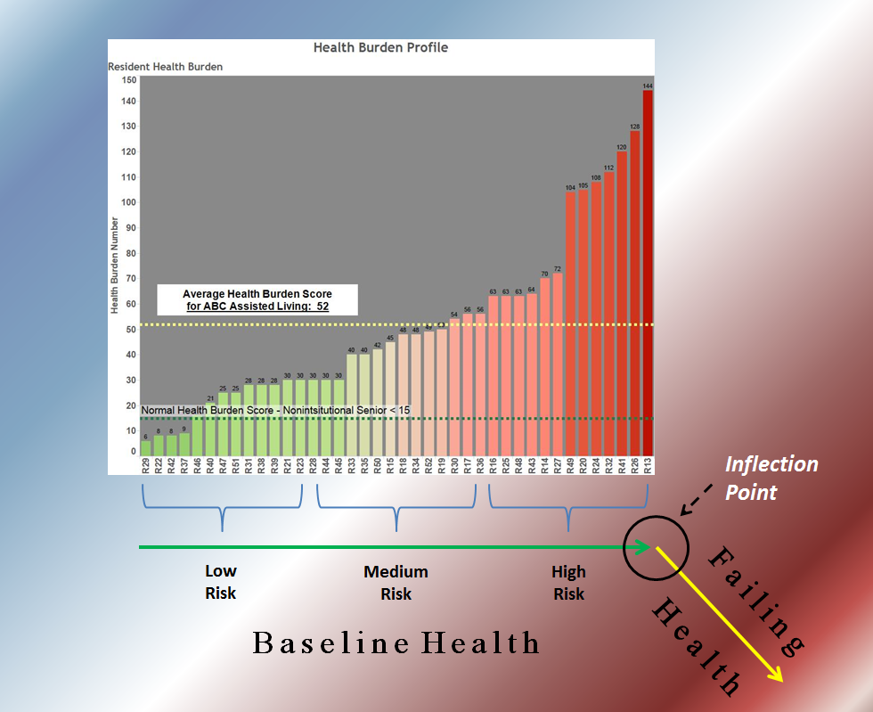
The HEALTH DYNAMICS data places the HEALTH BURDEN PROFILE of an AL just above a Health Attrition line. This allows AL employees to visualize and better appreciate the health risk of every resident by noting a resident’s proximity to the Inflection Point (the point of transition from Baseline Health to Failing Health).
Graph: The HEALTH BURDEN PROFILE was developed by Illumination Analytics using easily available basic health information of an AL’s residents. Health Burden reflects a resident’s risk for failing health. The higher the Health Burden Score, the higher the risk for loss of the resident to the ER, hospitalization, or transfer to a nursing home. Each individual bar represents the health burden score calculated for a specific resident. The coded names of all the residents in this AL are listed horizontally.
- Low Health Burden scores are green and located to the left, while higher Health Burden scores are red and located to the right.
- The contrast between the Health Burden scores of non-institutional seniors living independently in the community (whose values average less than 15) is immediately appreciated when compared to the scores of seniors living in this particular AL whose values range between 8 and 144.
Green and Yellow Health Attrition lines (below the graph): These lines represent the current state of health of a resident – either baseline (green) or failing (yellow), separated by The Inflection Point.
- Residents are grouped into Low Risk, Medium Risk, and High Risk based on their Health Burden Scores.
- The closer to the inflection point a resident is located (towards the right on the green line), the higher the Health Burden score and risk of failing health.
- Conversely, the farther away from the inflection point a resident is located (towards the left on the green line), the lower the Health Burden score and the more stable the resident is.
The 3 Risk Groups suggest a targeted and ‘risk-based’ approach to managing residents:
- Low Risk: The most stable residents. These residents require less frequent monitoring.
- Medium Risk: Residents with intermediate risk.
- High Risk: These residents require frequent monitoring.
Be vigilant and prepared for immediate pro-active intervention at the very earliest sign the resident has crossed the Inflection Point and entered into Failing Health.
These HEALTH DYNAMICS data can be constructed for every AL. The tangible advantage of being able to VISUALIZE the health risk of every resident using analytics opens new insights that will enhance AL health management, promising greater profitability and improved marketing.
<< Back to Blog Home
Latest Posts